Overview
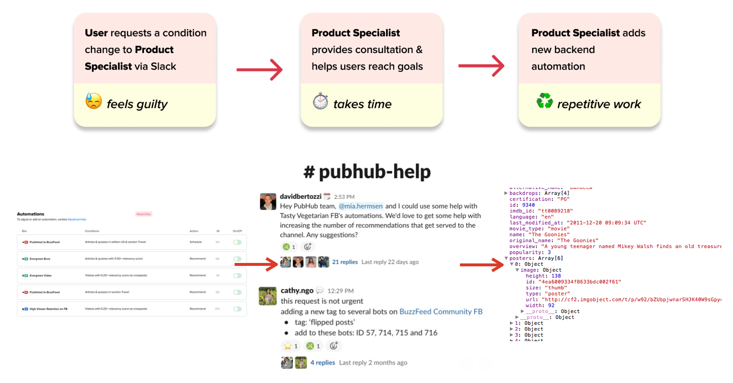
Currently, a majority of content on BuzzFeed socials is auto-generated. A bulk of social media posted content is actually older BuzzFeed articles that have done well in the past. Articles are auto-posted or recommended to social media strategists to be posted through a platform called Pubhub automations. Although this saves a lot of time, it takes a decent effort to optimize automations because users (social media strategists), don't have any editing privileges.
Problem
Currently to edit an automation users have to talk to the product specialist. This causes several problems:
-
Lost time ⏰ spent on consultation and manual changes on the backend could be used for other purposes
-
Disincentivizes users ❌ to experiment with their social automation strategy as they feel like they're bothering the product specialist with the slightest changes
-
Decreases autonomy 🤔 for users to learn how they can optimize automation parameters for themselves
Solution Overview
An interface that allows users to directly experiment and adjust their current social media automations.
As a stretch goal I also ideated some ways metrics could be incorporated to evaluate the effectiveness of different automation settings.
The Process: User Research
To inform design decisions for the final product, I had to understand the fine details of what users were currently doing. During user research calls with ten social publishers of varying rank - I asked:
- How do users make these decisions to edit parameters? Are there ways we could provide information to help them?
- Got a list of parameters and how often they're typically used to help introduce an engineering scalability plan as well as important metrics that help guide decision-making
- What is the current state of education with automations within the social publishers?
- Users are not intimidated by automation technicalities but rather they're unsure how different parameters affected results
- What action flows (editing, creating new automations) do users do the most?
- Users edit more than create, they will focus on only editing one automation at a time
Part 1: Prototyping Editing Interface 📝
While prototyping there was no pre-defined design system, however I looked through previous design files and made sure to keep consistency in type, buttons, toggles, symbols, form components and tabs by utilizing components and style Figma tools.
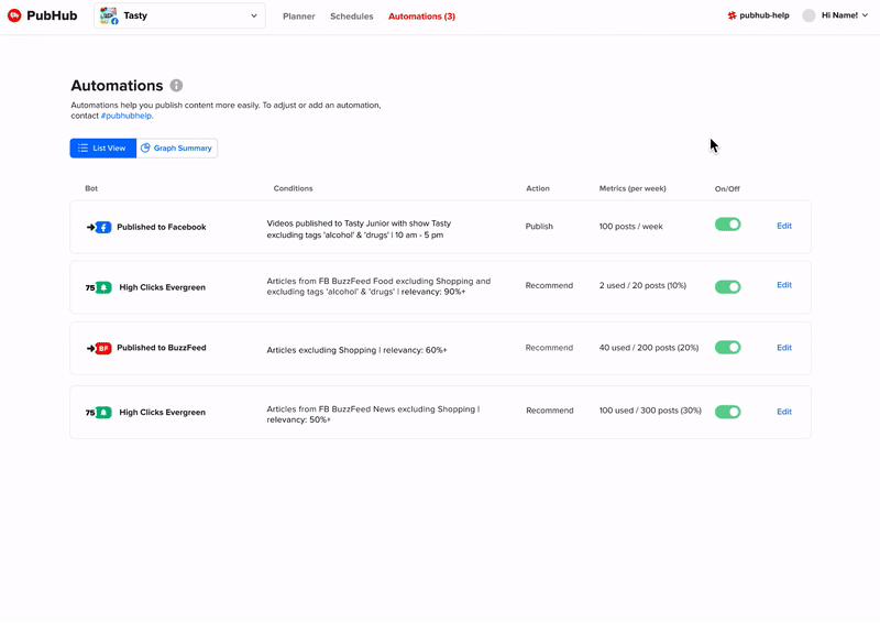
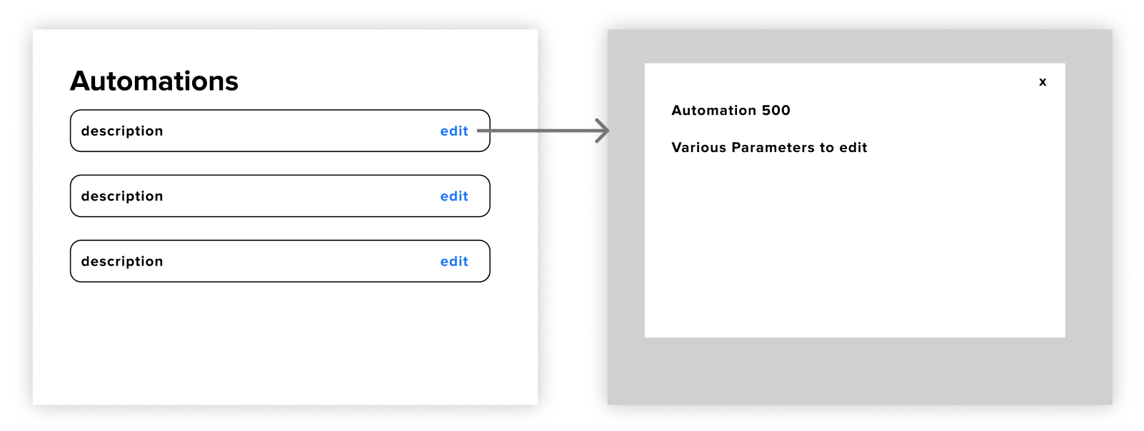
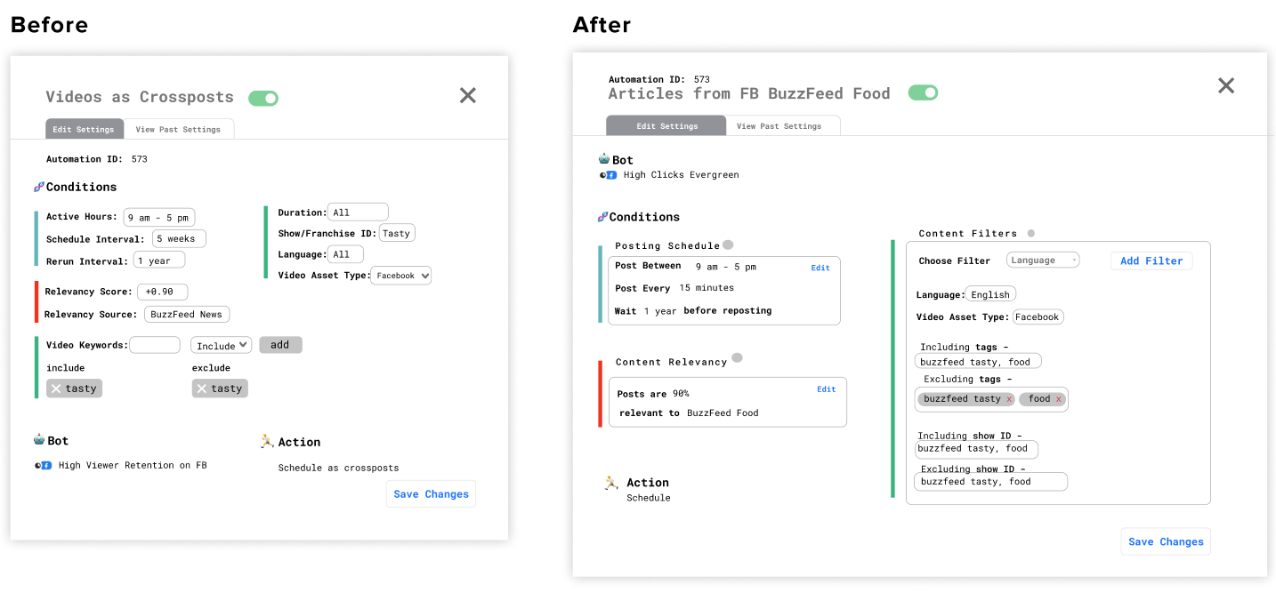
Details View Overview
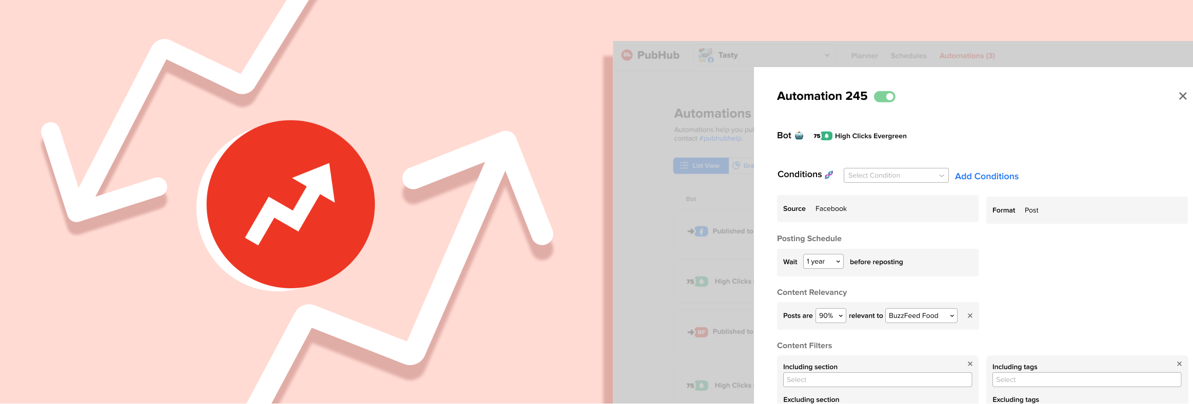
For the general flow I had settled on having the details view show up through a popup do reduce cognitive friction of opening a new page and allow users to do their day to day of quickly checking on different automations.
How do we add and remove conditions?
Adding
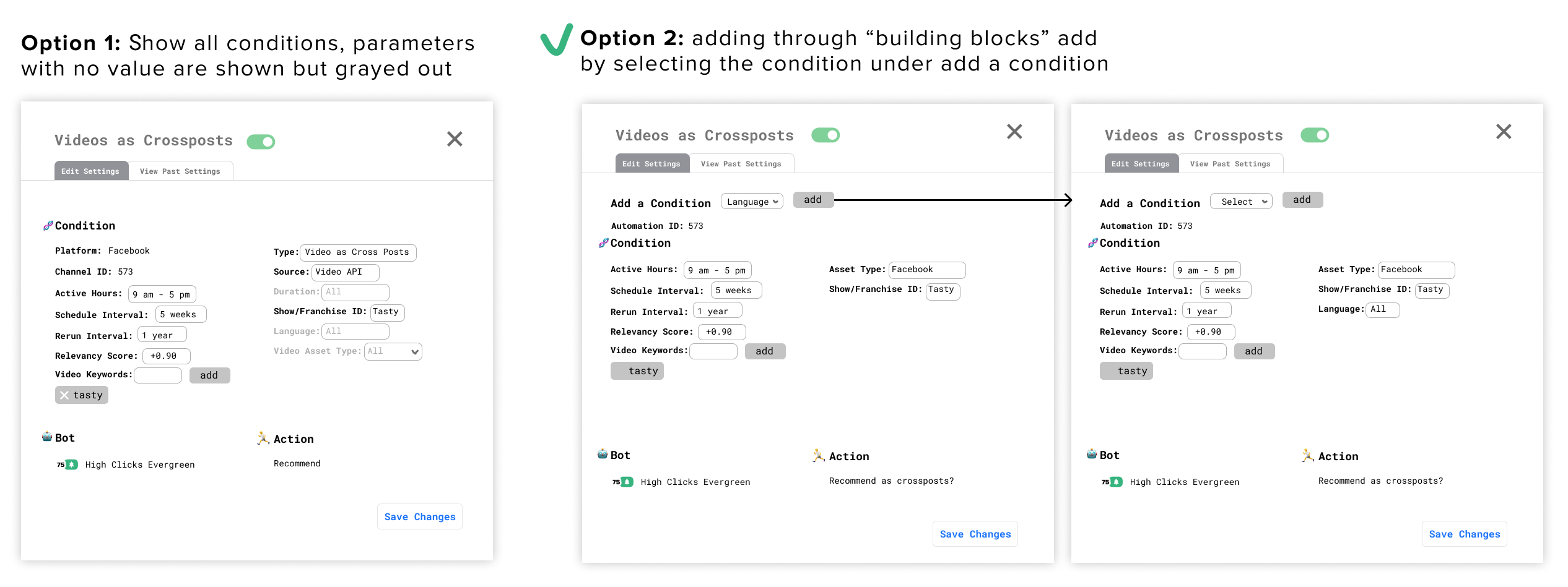
I went with option 2 because we didn't want information overload on the users by showing all the possible conditions they could activate when they only focused on one or two at a time. Because users tend to edit more than add new conditions it was better to have them focus on the edit action.
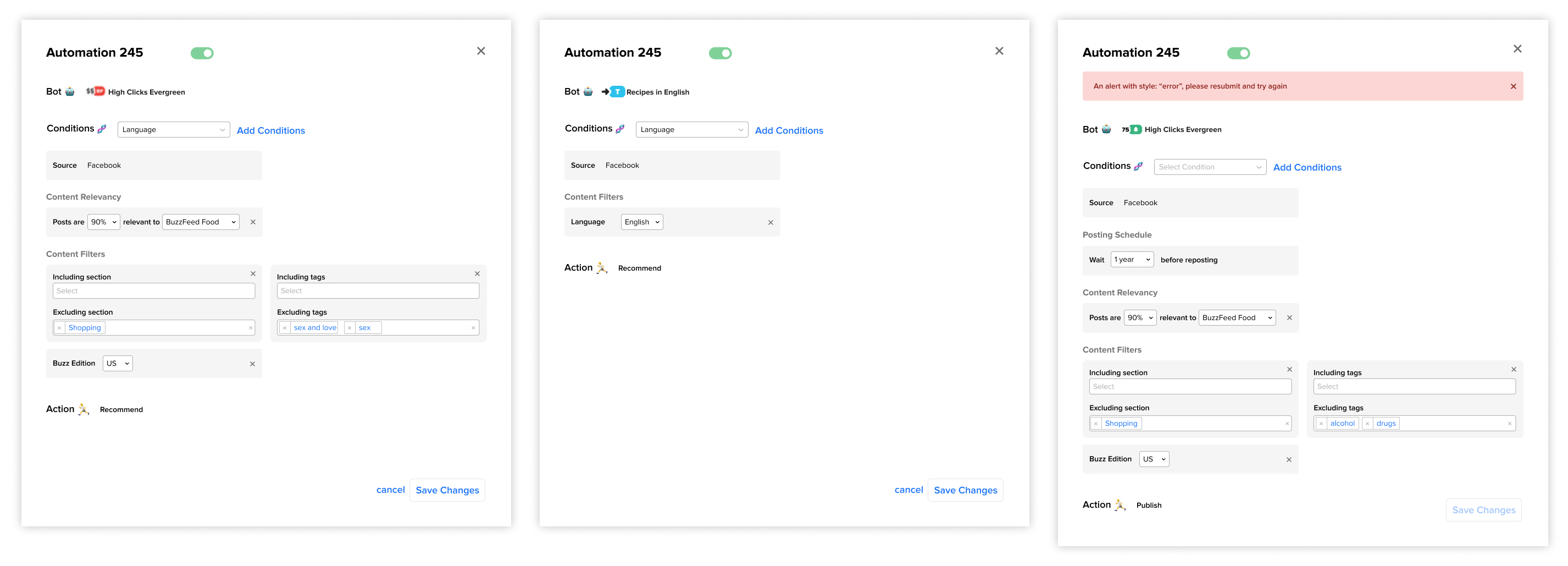
Editing/adding in a Block Format
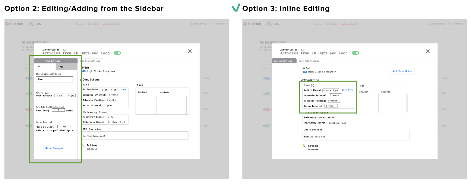
In the end I went with inline editing and adding because there wasn't any supplemental detail for each condition to justify a focused-in sidebar view.
Content Design: Making a Human Readable Format
There were two key edits involved to mitigate the need for explanatory supplemental text. One was breaking it up into three subsections that also had titled explaining the functions of each. The other was changing technical terms like "active hours" to more understandable ones like "post between".
Defining the Layout of the Page
F-Shape Pattern
The F-shape pattern indicates that people read horizontally downards. I experimented with having a layout in this approach below where the two most editable conditions (content relevancy and posting schedule) were next to each other before the user goes onto the next row.
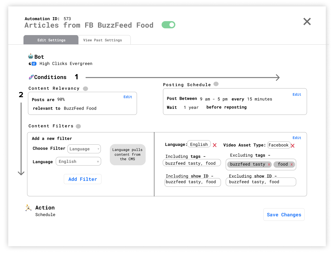
However, this led to the problem - how would it scale? With the two column approach this lead to the possibility of many awkward white spaces and unbalanced grids should there be missing parameters.
Separating the Subcategories
I then experimented with a layout that gave each subcategory equal weight.
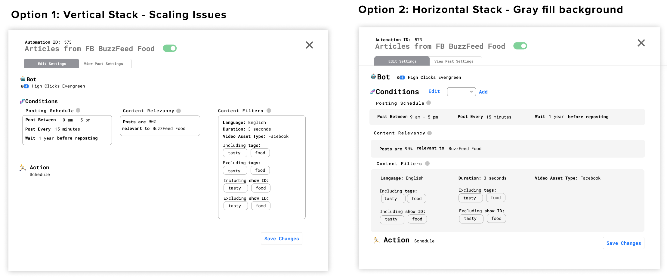 Option 1 introduced scalability issue as conditions added would make it more unbalanced. I leaned towards option 2 - vertical scanning - having every section layer on top of each other, and for conditions to fill up the space horizontally. This fell more in line with layer cake scanning - where the desired pattern would be to look at the subheadings before diving into the one they’re interested and scanning the details.
However, the giant blocks made it unclear that each condition was individually removable (not linked to each other). I was inspired by patterns in tools such as Scratch to break it up.
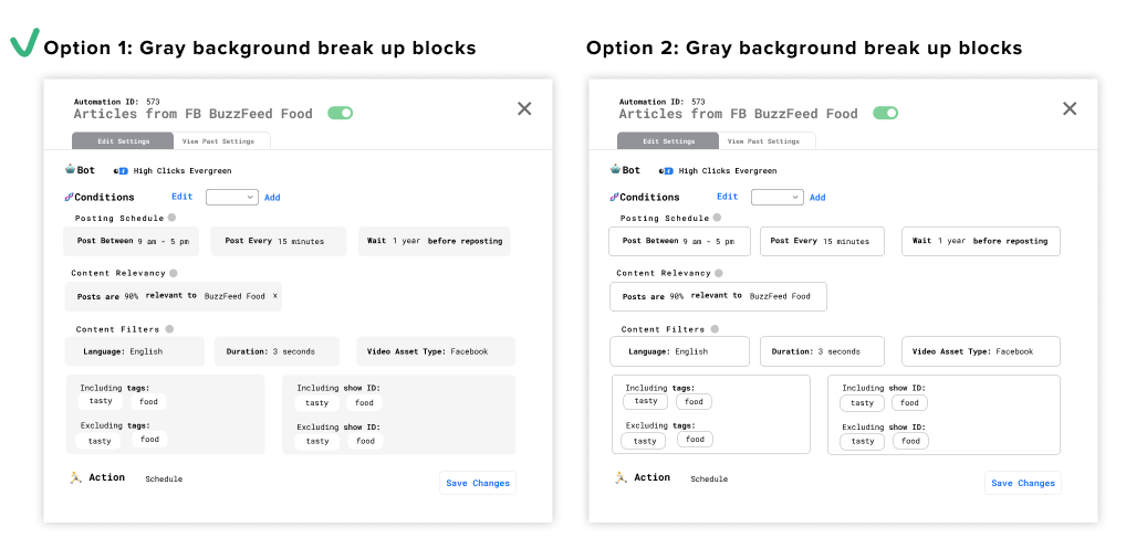
I maintained a gray background to again make each block more distinguishable from each other and the background.
User Testing + Feedback
After 5 rounds of user testing, I found most tasks were completed. The only struggle was that users would find the "Add" button but not understand what it meant. Once users interacted with the dropdown they were able to accomplish the task successfully. As a result, I changed the language of the add entrypoint from "Add" to "Add Condition". Although a small fix, I felt like it was the one that maximized feasibility and effectiveness.
Not only was the prototype, but it also had strong product value. Below is a quote from the head of social strategy, a stakeholder that manages all the social media strategists (user of the tool) and sets the tone for the team.
“I always don’t want to bug Mireille (Pubhub's Product Specialist) to change one small thing, and that was a hurdle so being able to edit is a big deal.” - Cathy Ngo, Head of Social Strategy
Part 2: Prototyping Data Metrics 📈
A major problem that we ran into was that users did not know when or what to edit. After brainstorming, I realized that optimizing consisted of two parts:
-
Looking in the past: To fine-tune automations, users would have to look at past data to refine what previously worked, or to revert to other versions.
-
Noticing differences: What is the current state of education with automations within the social publishers?
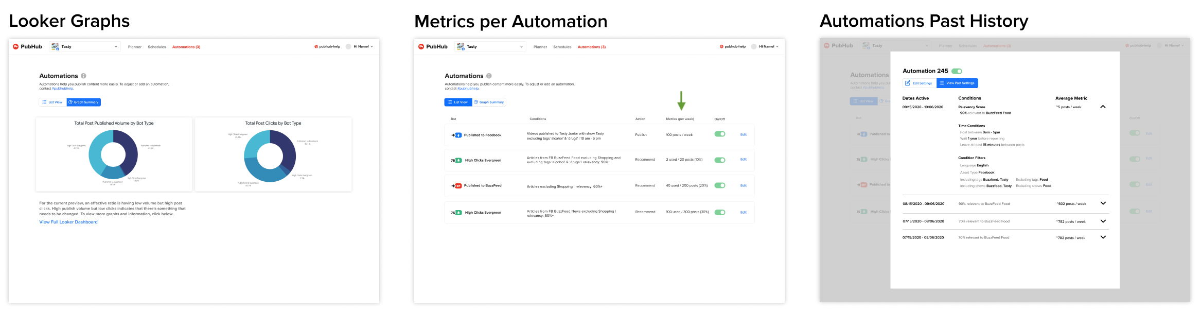
Looking into the Past
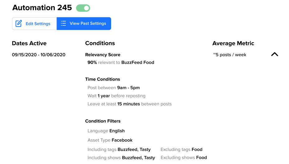
Past History
I created a past history view to help users understand the exact settings that led to certain metrics.
Noticing Differences
Looker Integration
From user research I also learned that there were Looker dashboards that people used - however many were unaware they existed. I brainstormed two options to have it as an outlink or to have it as a separate page with graphs.
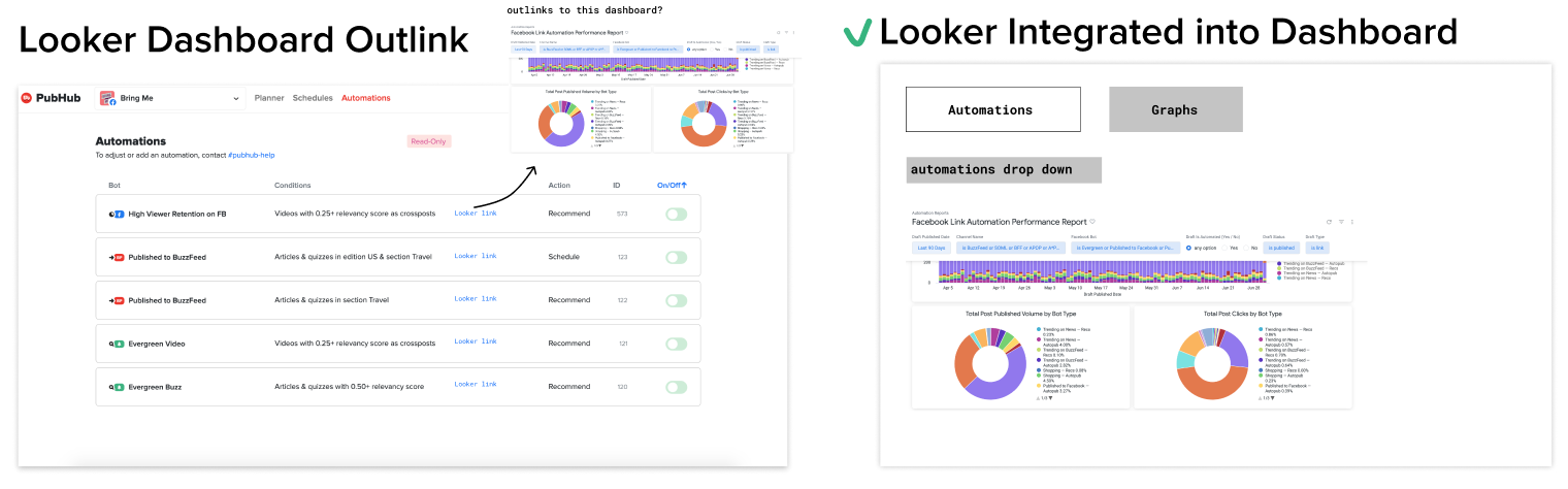
Although the outlink would be low-lift, it would be hard to ensure that users would be inclined to click on it. To ensure high visibility, we integrated the graphs into the UI itself so users wouldn't have to open up another tab.
Metrics
However, the difficulty with the Looker is that it was hard to tell the numerical changes for each automation.
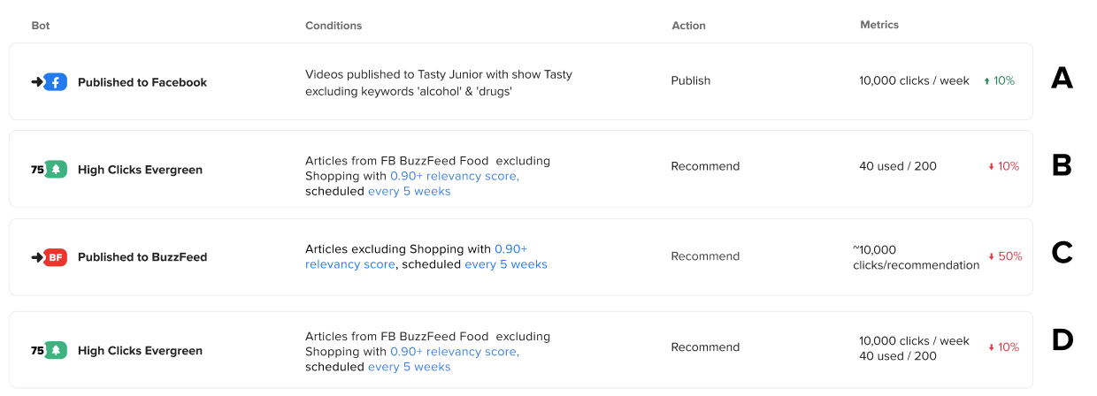
After talking with engineers and presenting different statistical options, I learned that the only feasible ones would be the volume published (for publishing) and also the number used out of total recommended (for recommendations). I also decided that the "percent changes", although a valid indicator of a positive or negative change - would need more data and testing to indicate whether or not an actual investigable change had occurred or if it was just within the flux of current events.
User Reactions from User Testing
When testing this feature - we found that 5/5 users had positive responses to all three options - in fact, many expressed they would use each metric for difference purposes.
“The metrics preview is good to keep an eye on pages that are 100% automated and quick changes. With the graphs, I want my team to keep an eye on pages we aren’t actively scheduling to. Finally, I like the past history because it makes retros easier.” - Cathy Ngo, Head of Social Strategy
Solution Overview
We ended up with positive feedback not only from the social media publishers on Buzzfeed, but also the Director of Social Media Strategy herself approved of the designs and agreed with the value-add of the product.
Edge Cases
I also collaborated with product and engineering to understand edge cases and prepare files for handoff.
Measuring Success
I would measure the success of this feature by qualitatively noting any changes in strategists' plans and observing the frequency and average time spent per day on the editing pages as well as the metric pages.
Takeaways
Validate with limited testing - I learned how to formulate hypothesis and different decision frameworks to predict which designs would work best for users.
Exercise product-thinking early - My first project was a notifications project, however I was able to quickly scope out the project and determine for the engineering capacity given, it would be better to use a free out-of-box alternative.
Extra
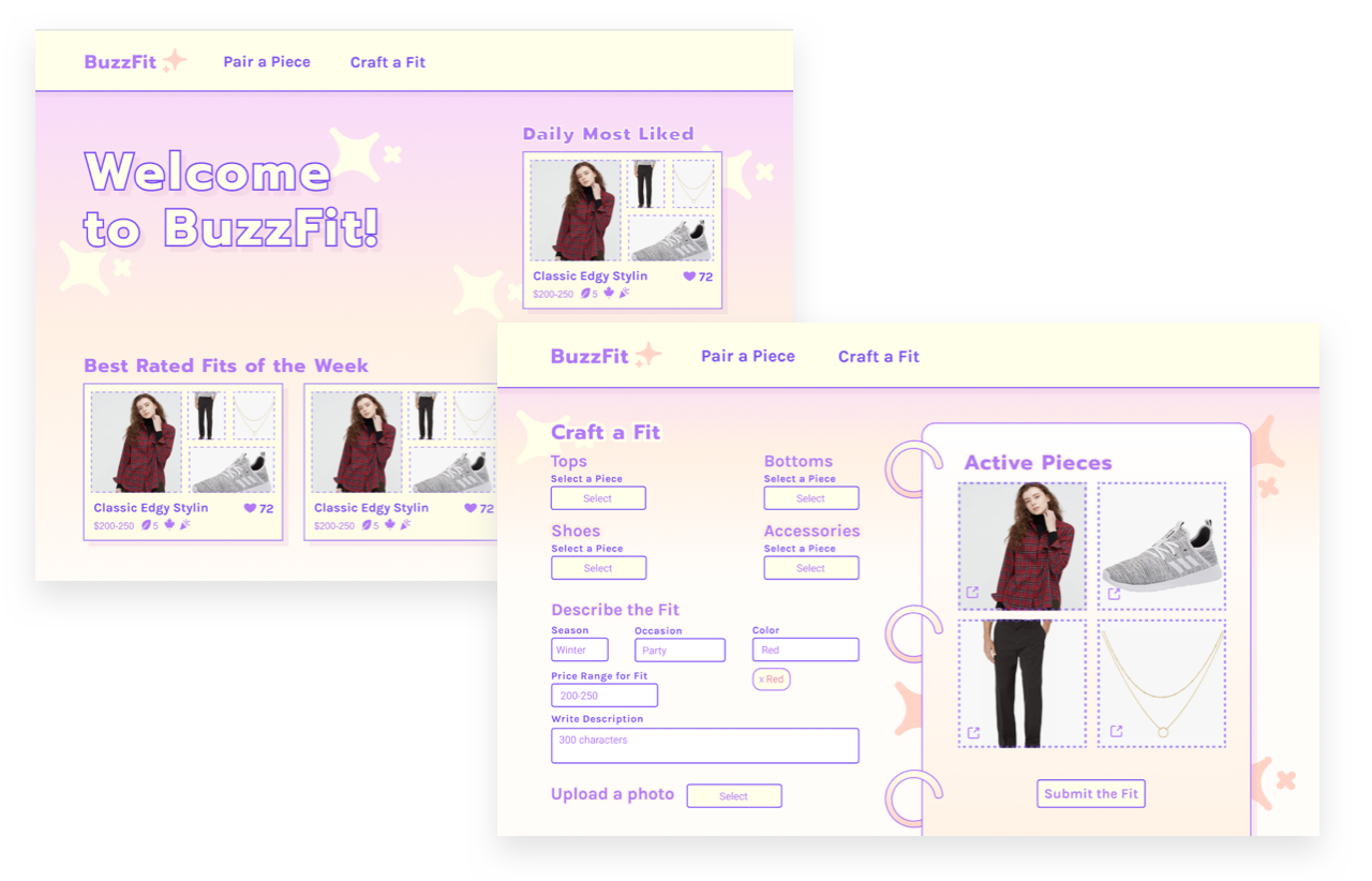 Besides my main internship I was able to accomplish two side projects - a Hackweek project involving matching fits for BuzzFeed Commerce that evolved my visual design skills and contributing to auditing the typography of BuzzFeed products for the design system team.